Here is a video of our class giving us some feedback from our final draft.
Wednesday, 18 December 2013
Questionaire for Alone
Q1: Did you enjoy the film?
Q2: What was your favourite bit?
Q3: If you were to direct the film, what would you change or do differently?
Q4: Would you be interested in watching the rest of the film?
Q5: Was the music effective and did it portray the genre of the film?
Q6: Was it edited well and what did you think of the editing?
Other comments:
Changes made along the way
When we were planning our film, editing and also when we were filming, there were some subtle changes that we needed to make. The first change that we made was the brother’s name. He was originally going to be cast as Jack, but we changed the name to Ben so that we could use a door name.
The next change that we made was the poster. As you can see in an older post, we had three different posters to choose from. The first one that we made had a picture of Maddie standing in front of a house. The house was black and white and Maddie was the only thing in colour. The general feedback for this was that Maddie also needed to be in black and white as she looked a little out of place. We made this change and this gave us our second poster. We then showed this off again and people preferred Maddie being in black and white, but they said that she needed to be a bit smaller as she looks out of proportion to the rest of the poster. We also changed this and then we showed off this one. The feedback was very positive and we decided to keep this poster.
Another change we made was to do with the boyfriend. Originally we was going to cast him in towards the end of the film opening but we thought that it would be hard to portray him as the boyfriend and it might leave the audience very confused about who it was. Instead of using this we decided to use a different shot. We thought that when Maddie ran outside, she could see and car and a general pedestrian to disappear to give it more of a dramatic feeling to Maddie and we hope that this was portrayed to the audience.
When editing we made some changes to the sound. When showing off the first draft of Alone. We received feedback from classmates and teachers. Our teacher Mrs Field said that there were too many shots of Maddie walking up and down the stairs. She suggested taking one of them out as it could make the audience lose concentration. She also said that when the title of Alone appears, it looks like there is a light flickering in the background. This is what we wanted to get across. She said that we could put a light bulb flicker to make it more obvious that it is a light.
When we were putting on the titles, one of our classmates had an idea that the title could flicker out like the light in Alone. It would also make them individual and more interesting to look at instead of a boring fade in and out.
GBHS Year 8 Feedback of Alone
The one comment that came from most year 8's was that the fade was very cleaver and they also thought that the music was very good. They thought it was very scary and helped to build up suspense. They also said it was very mysterious. With the fade, they thought it was very cleaver how the car faded as well. This also left lots of enigma codes with the children as they did not know why everyone was disappearing.
The things that they said could be improved was the acting and the shocks could be louder. But most responses were very positive and gave good feedback.
The things that they said could be improved was the acting and the shocks could be louder. But most responses were very positive and gave good feedback.
Teacher Feedback Alone Final
Mrs Field: Our Media Teacher
Compared to your first draft, the acting vastly improved. Megan looked more scared and gave a better emotion to the audience.
I really liked the outside shot. I liked how she went outside without her shoes as it showed her panic and made it more realistic. I also liked how I could see Megan's breath in the air. I also liked how when the car and boy walked past, they faded later as if to imply that they were coming to help.
On the first draft the 'no contacts' was hard to see and also you could tell that it was an image. I liked how you have edited so that you cannot see that it is an image and it is also a lot clearer to read.
I like the flicker on the titles as it adds more mystery and fits the genre. It also gives it some individuality and is not as boring as a basic fade.
Mr Butcher: An English Teacher
Mr Butcher really liked our film opening. He said that it was 'amazing'. He gave us one thing that we could change and that was the button press when she turns on the television. He said it sounded a little too loud and out of place. We lowered the sound to make it sound more realistic and when we showed him he said it was a lot better.
Class feedback for the first draft of Alone
In class we watched all of the rough cuts and gave some feedback to all of our classmates. We then received all of the feedback to help us re shoot or improve some of the titles. The class scored us out of 60 as if it was our real thing.
The average score we received for our production was 45. This is slightly inaccurate as we received some marks a lot higher and lower than the average which brought the average down. We had some very strong points which we should not change but we also had some items that needed changes. Our strong point was our sound. Everyone said that it was really good and it fitted well with the genre. Some people thought that the genre was unclear but some people understood that it was a horror and thriller. People also liked our sound effects. The alarm clock was also a strong positive. People liked the sound and also how loud it was.
The titles we used had some mixed reviews. Some people really liked the font and the colour but some people thought that some of the words were unclear against the windows. There was also a few spelling mistakes and grammatical errors which people picked up on and we have already changed them.
Most of the reviews about the acting were very positive, but they did think that there needed to be some more emotion in the facial expressions towards the end. This was also put to us from our teachers and when we re shoot we will take this into account.
Our class mates were really impressed with the amount of camera angles and different types of shots we used. People also really liked the editing and how that Maddie's family disappears.
Costumes
These are the items of clothing i will be wearing in our opening scene.
.jpg) |
| Pajama top |
.jpg) |
| Pajama bottoms |
.jpg) |
Jeans |
Monday, 16 December 2013
Official poster for Alone

This is the poster we have chosen to go around the country to help promote our film. We listened to all of the feedback we got from our classmates and teachers and tried to apply all of the changes to make it look even better. The general opinion on Maddie being in colour was not good. Most people thought that she looked better in black and white as it matches the background. We think it looks better like this. Our teacher also said that there was a window behind Maddie’s head that stuck out to her and took her eyes off of the main image we want to portray with the poster. We moved Maddie over to cover the window so all of the viewers’ attention will be on Maddie and not on the background.
Film posters for Alone
Here we have the three film posters that we have made to promote our film. It shows Maddie standing outside a house on her own. The text is big and bold to stand out. We asked a few of our classmates about our poster to see what we could improve.
Richard: I think that the image of the girl is too big. You could shrink her down a bit to fit the scale of the background.
We chose to do this as we thought it looked better and more realistic.
Miss Brookes: There is a window behind Maddies head which takes the eye off of Maddie, maybe move the picture or colour out the window.
We moved the picture of Maddie over to block off the window.
Below is the three film posters we have made.


Wednesday, 11 December 2013
Character profiles
Maddie Clark (Played by Megan Larner-Hoskins): Maddie is a typical teenage girl with a good normal life. She has a younger brother called Ben, a mother called Susan and a father called Peter. She also has a boyfriends called Dale. They are a well-off family and are very rich. She tends to be quite stuck up and likes to think she is very popular.
Ben Clark (Played by Ben Flatt): Ben is a brother to Maddie. He is a few years younger than Maddie. He is spoilt and gets most things he asks for. He lives on his xbox in his room. He tends to only come down for meal times.
Susan Clark (Played by Leigh Flatt): Mother to Maddie and Ben, she lives a life of luxury. She has a husband, Peter, that earns a lot of money so that they can afford the luxuries in life. She is very stuck up and boasts about how perfect her life is with all of the money that they can have.
Peter Clark: Peter, the father to Maddie and Ben, is a hard working business man. He is rarely around around as he is always away on business. He is always expensively dressed as he earns lots of money.
Dale Smith (Played by Ben Smith): Dale is Maddie's boyfriend. Although he does not have the luxuries that Maddie has. He trys really hard to impress Maddie. He is an only child and lives with his single mum in an apartment. He attends the same school as Maddie and is in the same year.
Tuesday, 3 December 2013
Analysis of the Walking Dead
I chose to analyse this film opening as it is similar to what we want to do and has similar themes. It has the theme of loneliness which is a big part of our film opening. I'm going to focus on the titles as they are presented quite well in this.
The font used is very bold and is in capitals which makes it stand out. All of the titles appear in front of a scene of a deserted place. There are pictures of the cast and their names appear when they are on screen. This is a good way to show people which actor/actress is who. The title appears in front of a black background so it stands out and informs people of the title. some titles fade out and others move across the screen until the shot changes. The shots are always moving and the transitions and fast and build tension. The music also builds a lot of suspense and tension.
The scenes feel deserted because there is no one there and everything is dirty and broken. We aren't going to make our scenes look like this. Our scenes are going to look like a town that is lived in except that no one is there. This will be mysterous and people won't think it's a zombie film
Monday, 2 December 2013
Sound Research
To research sound Ben flatt looked at similar films and how they used sound in different scenes. He looked at some of our inspirations such as 'I am Legend'. In 'I am Legend' there isn't much music because the silence is used to show how alone and isolated the character is. A lot of similar films also use silence and the sound of nature to convey that there are no more humans.
Ben then looked at theme songs for our inspirations and found that they create a very eerie and sounds like slow realisation as the music builds up. In the theme for 28 days later the music builds up and gets more intense. We think we should use something similar as Maddie will get clues of her situation as the beginning of the film progresses. We think this will help the audience understand what Maddie is feeling without her saying anything. We will need to find some similar music to this that is not copyrighted.
Ben then looked at theme songs for our inspirations and found that they create a very eerie and sounds like slow realisation as the music builds up. In the theme for 28 days later the music builds up and gets more intense. We think we should use something similar as Maddie will get clues of her situation as the beginning of the film progresses. We think this will help the audience understand what Maddie is feeling without her saying anything. We will need to find some similar music to this that is not copyrighted.
He thinks we could use sound effects to give the feeling of isolation and loneliness. He thinks using sounds of nature such as birds will create the atmosphere that we want. Putting more emphasis on the sounds Maddie makes will make the audience aware of the silence and make the atmosphere very eerie.
Friday, 29 November 2013
Location shot for Alone#2
 |
| Maddies brothers room |
 |
| Alarm clock |
 |
| Maddies parents room |
 |
| Hallway and front door |
 |
| Dinning table we're her family sit at |
 |
| The front shot. |
Location shots for Alone#1
 |
| Front of the house we're filming at. |
 |
| The sofa that Maddie will sit on |
 |
| Another shot of the sofa in the living room |
 |
| A tv that shows no signal when we turn it on |


Under the bed shot
 |
| Side angle of the stairs |
Script for Alone
Script for Alone
The film opening is set in an ordinary house with a middle class, healthy family. She wakes up one morning to find all of her family to have disappeared and she starts to have hallucinations of the previous day. After Maddie walks downstairs and realises the TV is not working and she calls for her dad
Maddie: (Shouts) DAD! DAD!
She then walks up the stairs and peers into her parents’ bedroom. She then looks over her shoulder and calls.
Her facial expressions show that she is starting to panic and hyperventilate.
Shots List
We are going to use a variaty of shots in our opening sequence. We will use different shots for different effects.
The camera shots we are going to use are:
Medium long shots
Establishing shots
Close ups
Extreme close ups
Over the shoulder shots
Medium shots
Tracking shots
Perspective shots
Paning shots

Storyboard Script
1. In the first shot we will pan around the room to Maddie’s face. This will be an establishing shot and will tell you about the character it belongs to. We will instantly see the main character and learn about her by looking at her room. We will be told a bit about her background and also about her interests.
2. In this shot we are going to have the clock change from 8:59 to 9:00. The alarm will then go off and Maddie will turn it off.
3. The next shot will be taken from under the bed and we will see Maddie’s feet come out of the bed. This will be a close up.
4. We will then have an over the shoulder shot of Maddie putting her hair down and shaking it.
5. Maddie will then walk down the stairs which we will film from the bottom of the stairs.
6. We will then cut to a different angle of her walking down the stairs which will be a medium shot.
7. Maddie will then walk into the living room which we will see from a medium long shot. This will ensure that the audience knows that this is the living room.
8. There will then be an over the shoulder shot of Maddie trying to turn the television on.
9. There will then be an extreme close up of Maddie’s hand trying to turn the television on.
10. We will then have a close up of the television which will have no signal.
11. In the next shot Maddie will call her dad. This will be a medium shot.
12. After she doesn’t hear a reply she rushes upstairs and we will see this from the side of the stairs.
13. There will then be an extreme close up of Maddie’s hand reaching for the door handle.
14. The camera will then switch to the inside and Maddie will peep around the corner.
15. The next shot will be a perspective shot. We will see Maddie walk into her parent’s room to find an empty bed.
16. Maddie will then call her brother by shouting for him. This will be an over the shoulder close up shot.
17. Maddie will then run across the landing and we will see this with a shot of her legs running past the camera.
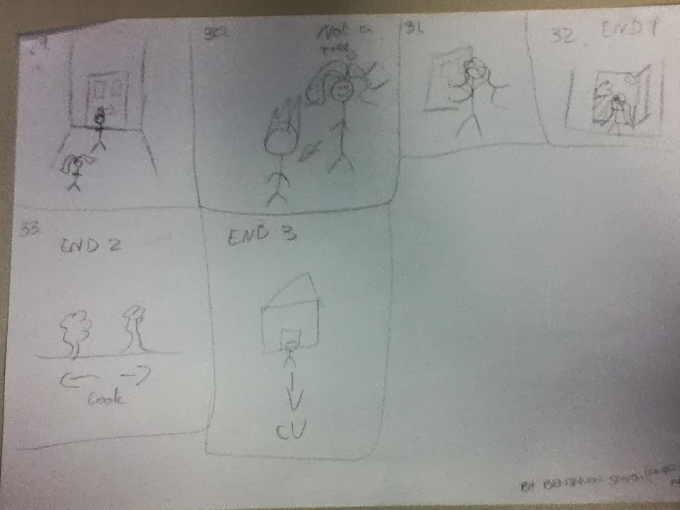
18. The next shot will be a medium shot of Maddie opening her brother’s door. On the storyboard it says jack on the door we are going to change this to Ben.
19. This is another perspective shot of an empty bedroom.
20. There will then be a close up of Maddies face as she starts to panic.
21. Maddie will then rush down the stairs again which we will see from a medium shot of the stairs.
22. Maddie will then run to the doorway to find her family. This will be an long shot of the family sitting at the table.
23. This will be the same shot but the family will fade away but Maddie will stay there.
24. In an act of panic Maddie gets her phone out and tries to phone someone but there are no contacts. This will be a close up of the phone.
25. Maddie goes to run outside but her boyfriend is in the hallway. She goes to hug him. This will be a medium shot.
26. This will be a medium shot of him fading away.
27. She will then look around for him which will be a medium shot.
28. This is the first possible ending. Maddie will open the door and the screen will fade out to black. This will be a medium long shot.
29. The second ending will be Maddie walking out the house and looking around but no one being there. This will be a perspective shot.
30. The third possible ending will be Maddie running towards the camera with a scared expression on her face.
Storyboard Comparison
First Draft: Here is the storyboard that Ben Smith drew to give us a basic idea of the shots we were going to use and the different angles.
 |
| 1-8 |
.jpg) |
| 9-28 |
 |
| 29-34 |
Final Draft: They then gave the basic drawings to me to draw up all of the shots as i took A level art. Here is the final storyboard
 |
| 1-6 |


Thursday, 28 November 2013
Storyboard
Here is our storyboard for our film opening 'Alone'. It has been narrated by Ben Flatt, Edited by Ben Smith and drawn by Megan
Tuesday, 19 November 2013
Pictures of team working
.jpg) |
| Here is a picture on Ben Flatt working on our meeting diary to upload to our blog |
.jpg) |
| This is a picture of Megan drawing out the final version of our storyboard |
 |
| Here is a picture of Ben Smith looking at the mise en scene of the film opeing of I Am Legend |
Monday, 18 November 2013
Our Inspirations
'I am Legend'
'I am Legend' is a film about a man living in an abandoned city because of a zombie apocalypse.
When watching this film we noticed how similar in some ways it is to our opening film sequence. At the very start of 'I am Legend' we notice the camera angles are very wide to show the grand scale of the city and how empty the streets of New York are because of the zombie Apocalypse. They've also done various birds eye views of the empty city. Noticeably they've put the titles on top of buildings and on streets to make it look like its included in the surroundings.
'28 Days Later'
28 days later is a film about a man that was in a comma and he wakes up to find it is the end of the world and everyone has turned into zombies.
When watching the trailer we saw that the man was all alone in London and it was what used to be a crowded street. This is the look and feeling we want to put across in our film. I really liked how that the phones were swinging from their cord as it shows that there is no one around to help in person or over the phone. This is the similarity between the two films. I really like the costumes that they have used as they fit the genre well. As he wakes up in hospital he leaves with only his hospital gown. We would like to recreate the scale that they have done in this film but we realise that it will be extremely hard. We did not want our film to be in the dark as it would be to cliché. We really like how fear is created even though the lighting does not fit in with the feelings. This is another reason why this film inspired us to film one like it. There are very little props in the trailer and we think that we would change that. We will show televisions and mobile phones to show the time that the film is set in. We have decided to do this so the film will seem more realistic to a young teenage girl of the present day.
When watching the trailer we saw that the man was all alone in London and it was what used to be a crowded street. This is the look and feeling we want to put across in our film. I really liked how that the phones were swinging from their cord as it shows that there is no one around to help in person or over the phone. This is the similarity between the two films. I really like the costumes that they have used as they fit the genre well. As he wakes up in hospital he leaves with only his hospital gown. We would like to recreate the scale that they have done in this film but we realise that it will be extremely hard. We did not want our film to be in the dark as it would be to cliché. We really like how fear is created even though the lighting does not fit in with the feelings. This is another reason why this film inspired us to film one like it. There are very little props in the trailer and we think that we would change that. We will show televisions and mobile phones to show the time that the film is set in. We have decided to do this so the film will seem more realistic to a young teenage girl of the present day.
Thursday, 7 November 2013
Alone feedback for the class
After pitching our film to the class, we were given some feedback on how we
could improve our film further. The main point that we had to work on was to
not put too much into the short opening. We were given ideas of how we could condense
all of the important scenes into one. We will use fades and small flashbacks to
show previous activities of the night before. We will also use two layers and
have two different shots other each other so it looks like she is remembering
her family.
Monday, 4 November 2013
Alone Film pitch
Over the half term, we got set a task to create a pitch of the opening of a film. The film could have been about anything and we got to pick the genre we wanted. When we get back to present the pitch to the group we were put in and decide which one we think is best. We chose this film opening because we felt that it was the most realistic one to do, the other two film openings were two technical.
Saturday, 2 November 2013
Titles

Title 1 - Institution 0:02-0:07
Title 2 - Production company 0:09-0:14
Title 3 - Association 0:16-0:21
Title 4 - Starring 0:26-0:29
Title 5 - Napoleon Dynamite 0:31-0:36
Title 6 - Jon Gries 0:39-0:45
Title 7 - Ason Ruell 0:48-0:53
Title 8 - Efren Ramirez 0:56-1:02
Title 9 - Tina Majorino 1:04-1:09
Title 10- Diedrich Bader 1:12-1:16
Title 11- Casting by Rory Weitz 1:22-1:26
Title 12- Music by John Swihart 1:30-1:34
Title 13- Edited by Jeremy Coon 1:39-1:43
Title 14- Production by Cory Lonenzen 1:48-1:54
Title 15- Director of photography by Mumn Powell 1:56-2:01
Title 16- Produced by Jeremy Coon, Chris Wyatt and Sean Covel 2:05-2:10
Title 18- Writen by Jared Hess and Jeksha Hess 2:13-2:17
Title 19- Directed by Jared Hess 2:27-2:40
Each different title that appears is different but all have something in common, for example some are presented on plates using food but its different types of food. From this opening sequences we get the inmpression that the film is going to be about a young child who is intrested in space and food.
Art of the Title
1. What is the definition of a Title Sequence?
A Title Sequence tells us the names of the people who are responsible for being in the film and the making of the film or TV program.
2. What is the function of a Title Sequence?
The function of a Title Sequence is to name the people who are credited for the making of the film. Title sequences are usually created and presented in a way which fits the genre. For example, in a Rom com movie, the typography used could be girly and pink, and the non diagetic sound (background music) could be a happy song.
3. Name three films featured in the A Brief History of the Art of the Title Sequence?
- Forest Gump
- The Ward
- Juno
4. Select a film Title Sequence shown in the A Brief History of the Art of the Title Sequence and discuss how the Title Sequence uses Typography Elements (text), Visual Imagery/Sound Elements and what kind of mood/feeling is created as a result?
Coraline - The title sequence is quite a spooky one as the main title 'coraline' is written in stitching which we don't understand as we haven't watched the film but it will be come clear when we do. The actual titles are written in quite bold letters. The music is the background is quite dark and scary to start of with. The music is quite tense to start of with as the music increases quickly and then decreases suddenly to maybe trick the audience. Towards the end of the title sequence the music starts to become more upbeat and chirpy which maybe indicates the film is a happy one with a dark twist.

5. What does the use of Typography Elements (text), Visual Imagery/Sound Elements in the chosen film Title Sequence suggest about the theme/content of the film?
The style of the typography in this case is the main title of the film 'Coraline' sowed into some kind of fabric with a button acting as the 'o'. At this point we don't know what the film is about but judging by the creepy music is defiantly got a dark twist to it.

6. Select another film Title Sequence shown in the A Brief History of the Art of the Title Sequence and discuss how the Title Sequence uses Typography Elements (text), Visual Imagery/Sound Elements and what kind of mood/feeling is created as a result? Name of chosen Film Title Sequence: Use of Typography Elements (text): Use of Visual Imagery/Sound Elements: Mood/feeling:
The Ward - We can clearly tell this is a horror film from right at the start as the music is tracking backwards down a hospital corridor with the main lights flashing, this is a typical scene from a horror movie. Not only does the visual imagery tell us this but so does the music. At first its sounds like someone whistling with the thunder and lighting effect in the background then it gets louder and the sound of lightning appears and a loud organ starts. The main title 'The Ward' is created as though it is an object in the corridor and the camera goes through one of the letters. It then appears in a large font in capital letters as 'John Carpenter's The Ward'. Throughout the title sequence there are animated pictures of people in the olden days getting punished for whatever reason and glass smashing at various points. The titles of the various cast members and key production people are quite simple but work well with the film.

7. What does the use of Typography Elements (text), Visual Imagery/Sound Elements in the chosen film Title Sequence suggest about the theme/content of the film?
The typography suggests that its a horror film from right at the beginning of the title sequence. Its visual imagery is set in a hospital with a broken lights and thunder and lightning in the background. The music is at first someone whistling then continues to play creepy organ music, accompanied by the large font of the main title.

8.Visit the following website;
Art of the Title watch the sequences and read the 6 Film Title Sequence interview with Richard Morrison. The typography for Sweeney Todd is quite sinister, the title for 'Sweeney Todd' is red, this symbolises blood, death and rather haunting things.
9. What does the use of Typography Elements (text), Visual Imagery/Sound Elements in the chosen film Title Sequence suggest about the theme/content of the film?
9. What does the use of Typography Elements (text), Visual Imagery/Sound Elements in the chosen film Title Sequence suggest about the theme/content of the film?
The title starts just as the organ finishes playing and a quite noise replaces the organ, a haunting noise that sounds like violins in the back ground, on top of that the next scene that comes up is of a dark raining sky and you can here thunder in the back ground, this helps to give the film a mysterious atmosphere as the audience try to work out where it is, you then start to see chimneys and smoke, this is when the titles of the people that were involved in the film begin to appear. The text is in white so it stands out against the dark back ground, and is in an old fashioned Victorian text, so it fits with the era of the film, the writing also looks like skeleton bones which fits in with the main part of the film which is death.As the film carries on and the titles, objects appear that are going to be see through out the film such as a bolts and screws that are covered in blood and even a stream of blood, this makes the film look much more darker and gloomier, as the red contrasts with the dark back ground. When the title of the film appear in bold red against the black back ground, the music increases and picks up its pace and the writing is the only thing on the screen, this makes it stand out and get the audience more excited for it as the title of the film builds the tension and excitement of the film, and makes it dramatic as if the title is the grand opening of the film. After the name of the title is shown the objects shown become much faster and more intense such as meat being grinned through a machine and the meat falling out a and the screen switching to more blood.
10. What does Richard Morrison explain about the Film Title Sequence?
Richard Morrison quotes "Animating blood and its movement became the most crucial and challenging element of the sequence. We had to build special platforms within which we imitated blood movement and filmed it"
11. Does Richard Morrison feel the Film Title Sequence was successful, why or why not? Name of 2nd chosen Film Title Sequence created by Richard Morrison: Use of Typography Elements (text): Use of Visual Imagery/Sound Elements: Mood/feeling:
Richard Morrison quotes "And we had to give it this comical feel, which worked really well. That was a dream project. We would love to work on something similar."
12. What does the use of Typography Elements (text), Visual Imagery/Sound Elements in the chosen film Title Sequence suggest about the theme/content of the film?
12. What does the use of Typography Elements (text), Visual Imagery/Sound Elements in the chosen film Title Sequence suggest about the theme/content of the film?
High Fidelity - Its starts of with the production logo of 'Touchstone Pictures' whist in the background there is some shuffling. After the slight noise has disappeared a song plays and its a zoom in shot of a record player. The main title and the production names are in red to stand out from the black background. The rest of the titles are presented on posters and stickers.
13. What does Richard Morrison explain about the Film Title Sequence?
13. What does Richard Morrison explain about the Film Title Sequence?
Richard Morrison tried to keep the film as original, simple and distinctive enough but at the same time reflecting on the older classier movies and still keeping it feeling fresh and contemporary at the same time. He quotes "Many creative will tell you that short pieces are the most difficult ones because you need to ensure that you make the most of every single second, graphically and visually."
14. Does Richard Morrison feel the Film Title Sequence was successful?
14. Does Richard Morrison feel the Film Title Sequence was successful?
Richard Morrison exclaimed that it went just how he wanted it to go. "I believed simple content would be the answer to a finely tuned piece of work. Hence, the sequence abounds in this somewhat old-fashioned vintage style ‘brand identity’ approach with a titled logotype centrally set in a 3D background movement."
Turning Pages
I chose this opening scene that was made by pupils in the school Latymer because i think its really good. The camera shot that pans across city is really effective and it looks like something from a professional film. The font on the titles really tells us what genre it is (romance). At the start of the film, the girl is using a handheld camera which wasn't completely steady but that gave of a whole other effect to the film. The music also gives us the vibe of what genre it is.There were good use of props e.g. the handheld camera and book. Overall, i think the acting was good and it was very successful. I would give this mark a 55/60.
Thursday, 24 October 2013
Thursday, 10 October 2013
Opening Scene of The Conjuring
Enigma Code - What questions are you asking yourself?
- Where are they?
- What are they talking about?
- Who's doll is it?
- Who are they two girls talking too?
- Why did he sound so surprised when they said they gave the doll permission?
- Why is the doll on the floor?
- How did they doll get back into the house?
Sound - The sound at the very beginning of this film is a high pitched violin playing. I think they used this music because it comes across quite scary and high pitched noises are usually associated with horror films of which this is. This is non- diegetic as the characters cannot hear this, but it tells us that it is going to be a horror film because of the distinctive sound. Hearing this music already makes you feel slightly scared and its only the very start of the film. Also, whilst the scene of the two girls coming home from work is playing, there's talking in the background of the two girls speaking to the man and woman about the doll, this is non-diegetic as the two characters can't hear them speaking. The music plays again but this time its not the high pitched violins but a sudden piano sound, this is also a distinctive sound from a typical horror movie.
Editing - There is not much editing in this opening scene, it just flips from shot to shot. This carries out smoothly and changes each shot from each other and carries them on. The camera is concentrating on certain characters, and is showing you different incites to each persons view.
Camera - Frames

This is an extreme close up and its used to show the damaged, scary detail in the possessed doll. If this frame was maybe just a close up, it would have the same impact on the extreme close up that this is showing. It does zoom out slightly but you don't see the full face of the doll until a different frame.

This is a close up of the doll. They've used this frame as well as the other one to show the true look of the doll. After seeing the first frame of the doll (extreme close up) the audience wonder what the doll looks like, how big it is, what its wearing ect. After showing the audience this frame, its clearly showing them the true identity of the doll.
Movement - At first the movement of this opening scene is zoom out. This is then drawing your attention to the focus and the main point, which in this case is the doll. It draws attention and builds tension to look of the doll. In the next scene it also zooms out giving the audience a full perspective of the surroundings in the scene.
Angle - The angles on most shots are neutral and quite focal, to draw your attention to specific props in the scene, for example the doll at the beginning.
Mise en Scene
Costumes - The costume in this opening scene varies as each character is wearing different things. The doll is wearing a little girls dress which has been torn and stained. Normally when there is a little girl in a horror film, they tend to be wearing a disturbing outfit to scare the audience. Whilst in the interview between the two girls and the man and women, the two girls are just wearing everyday clothed to show that they are still going about their everyday lives however, when the two girls come home from work, they are wearing the nurses uniform to clearly show what they do for a living.
Lighting - The lighting in this opening scene is very dark. In the interview, it seems as if they've purposely darkened the room too make it seem that little bit more scary. Its quite hard to see the characters face because of the facial shadows.When the woman goes into the spare room, a light appears on her face just like when a torch is held underneath a face when someone is telling a horror story. The light flashing in the room also adds a scary effect to the film. Throughout most of the opening the lighting is very dull and dark to add the scary effect.
Characters - The only visible characters at the start of this opening scene are the two girls and the boy. From right at the beginning the boy is in the scene but has no relevance to the film from what we know. The two girls are the main vocal point of this. We hear a male talking but we cant see him. At the very end we are shown the males face from a side angle. The camera pans around and we are shown his identity and then shown his partner.
Props - There aren't a great deal of props in the opening of 'The Conjuring' but a main prop in this opening scene is the doll. The doll is a major part of it as she is what they're talking about and is the main topic of conversation. Another small prop in this scene is the smashed photo frame. They use this to show that the 'Demon' has done this to the picture of the two girls.
Preliminary Task - 'Fug life'
.jpg) |
| Here is a photograph of George drawing and annotating the storyboard for our Preliminary Task. When drawing up the storyboard, we took into consideration the various different frames, camera angles and movements we wanted to capture throughout. |
.jpg) |
| Here is a photograph of Becky writing up a list of all the props and items of costume we needed for the task |
.jpg)
Here is a photograph of Megan reading and evaluating the script for the task, which we all discussed and came to an agreement on, deciding that it was appropriate for the Comedy genre.
Evaluation
We have now completed out final preliminary task for our final outcome being the short comedy 'fug life'. We managed the task by setting individual roles between us. As George is quite artist he did the story board and also did some of the editing for the final draft. Becky wrote up all the costume ideas and props and i evaluated the ideas and brought my own ideas to the table.
We planned our sequence by coming up with a rough idea of a story line then story boarding it. However, we didn't take into account all of the different frames and angles which we needed such as high angle shot and a tracking shot, so the story was re-drafted.
Very little technology was used in the making of this task, just a simple camera and tri-pod which was used for the still shots and a wheelchair for the tracking shot. The only technology used was the mobile phone for the music that played and the computer when using the editing software (adobe premier).
When filming the shot we had to keep referring to the storyboard to make sure we were following it exactly how we had wrote it down. We also had to make sure the classrooms we wanted to use were available, for example, the classroom (l9) was not available when we needed it so we had to use the drama room.
Overall, im pleased with the final outcome of our task. i think we managed to ull of the genre for our task but i do not think it was as funny as we maybe imagined it to be. We have learnt a lot for this task for example its vital to have your story board when filming and when filming certain shots a decent amount of time should be left.
Sunday, 6 October 2013
Peer analysis of Juno worksheet
Group
|
How was the use of camera shots?
|
Use of editing?
|
Use of lighting?
|
Overall success of video
|
Sarah, George and Kaitlyn.
|
They have used long shots to show the surroundings of the scene but you can stil see the actor clearly. They have used all of the correct camera shots in this scene just like the original opening. The have also used medium shots to show the expressions and gestures.
|
The use of editing was used very widely. Every different shot seemed to have a different transition. They did all work smoothly however some of the transitions maybe weren't needed for the opening scene but they have definaltly proved that they are confident when using premier.
|
As they only had the use of lighting outside, it worked well which shows the setting of the scene. This is just like the original and that was the task, and it was successfully completed
|
In my opinion, i feel this is the best video. although they may have gone over the top on the transitions, it showed they were confident with using premier and it was very similar to the opening of the real Juno openeing.
|
James and Emma.
|
The camera shots are very similar to the original Juno openeing scene. Their tracking shot is very steady and look professional. They've also shown medium shots and this helps us see the expressions on the characters face.
|
Whilst editing its clear they've used a different lighting in the beggining and in the middle. The effect is brighter in the beggining and darker in the middle. Also, they didnt use any transitions which was key feature in this task.
|
The only natural lighting in this opening is the sun however it does change due to the fact that they used effects on the lighting. In my opinion i dont feel like this works because the sun on its own would have made it look more effective.
|
I do not think the editing is very successful because they have not used transitions and used lighting effects when the light should have been natural. However the timing of each of their clips was very natural to the original and looks very much like the real Juno opening scene.
|
Charlotte, Ben and Ben
|
they've used a variety of different shots; long shots too show the surrounding and close up too show the shoes which was a key shot in the opening scene. They have also ued medium shots to show the expressions on the characters face.
|
They've used an effect to make the scenes look animated just like in the original opening and also used a few transitions from each different shot thisdramatically changes each shot and carries it out to the next one.
|
The use of lighting in this scene is just daylight, this is the same as the original clip. This is good as the task that we was given is to remake the Juno opening scene as similar to the original as possible, and in the original the lighting was just the daytime light to show the setting.
|
This clip was successful. I feel that the big error was having the title page before the clip started, however the transitions ran smoothly and they have used a sort of animated effect on each clip to make it as animated as they could to make it look like the same as the real Juno opening scene.
|
Dom and Lara
|
The use of the camera was very effective. They paned left and right, also tilted the camera up and down when needed. If there was one negative it would be the camera being a shaky at the start.
|
The use of transitions in their opening of juno were really successful. The music also was in time to the original opening scene as well as this they've proved they are confident with using premier.
|
The lighting when it was filmed was overcast, however they used an effect that made it look more cartoon like to fit the Juno clip. This also made the lighting a lot brighter, possibly a bit too bright.
|
Overall, i feel like this was a succesful opening video and was very well thought out as the transitions ran smoothly and the timing was perfect to the second.
|
Subscribe to:
Comments (Atom)